The title panel: the podcast-clip layout every big account uses, and when to use it
Look at the clips that travel from any large podcast and most of them share one shape: a headline on top, the picture in a box, the captions underneath. Here is why that layout wins, when the plain full-frame cut is better, and how to get either in one click.
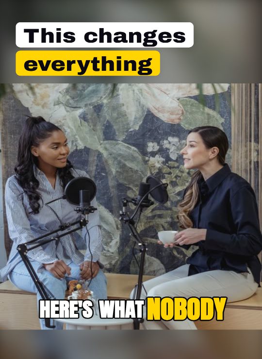
Scroll any feed of podcast clips and you will notice the same composition again and again: a bold title sitting on its own panel above the picture, the speaker in a box in the middle, and the captions in a band below. It is not a fashion. It is the shape that solves three problems at once, and it is worth understanding before you decide whether your clips should wear it.
What the panel fixes
A vertical clip cut from a wide recording has very little safe space. The face takes the middle, the platform's own buttons take the right edge and the bottom, and whatever text you add competes with both. Put a headline over the picture and, on a close-up, it lands on a forehead or across the eyes. The panel gives the headline a home that never touches the face, and because that home is the top of the frame, it also becomes the thumbnail: a viewer sees the promise before the video even plays.
The band below does the same job for the captions. Words over a busy picture need a heavy outline to stay legible; words on a calm band can be lighter, larger and closer to how a subtitle is meant to look. And the picture in the middle is shown a little smaller, which is what a screen recording, a slide or a two-person shot needed anyway.
Intro or whole clip
There are two ways to run it. The intro version shows the panel for the opening seconds, while the title does its work, then fades to the full frame so the rest of the clip breathes. The whole-clip version keeps the panel throughout, which suits screen recordings and interviews where the picture is not the point. Most talking-head clips are better with the intro: the hook is delivered, and then the viewer gets the whole face.
| The clip is | Use | Why |
|---|---|---|
| One person talking to camera | Panel, intro only | The title lands on its own panel, then the face gets the frame |
| A two-person podcast | Panel, whole clip | Both speakers fit the box; the split view still works inside it |
| A screen recording or slides | Panel, whole clip | Text on screen stays readable at the smaller box size |
| Fast, funny, physical | Full frame, no panel | The picture is the joke; a panel would shrink it |
| A quote you want shared | Panel, whole clip | The headline is the quote and it is visible in every frame and every screenshot |
The details that make it look designed rather than templated
- The panel colour should follow the caption style. A neon caption look wants a deep violet panel, a warm highlight wants a warm one; a black panel under every look reads as a default nobody chose.
- Keep the headline off the top five percent of the frame. That strip is where the platform draws its own chrome.
- The picture in the box should be cropped around the face, with room above the hair. A box that slices the top of the head is the most common mistake in hand-made versions.
- The captions belong on the band, not inside the picture, and they should start a beat after the title so the title is read first.
The title panel is the house default for new videos: intro mode, the panel painted from a blurred copy of the picture, colours taken from your caption style. Switch it to whole-clip or off per clip in the look editor, or set it once in your brand template.
Paste a long video and see the panel on your own clips, in your own colours.
Want clips like this from your own footage? Try the AI video clipping tool free, no credit card.
Turn your long videos into viral shorts
SpikeReel finds your best moments, reframes them vertical, and burns in captions, automatically.
Start free